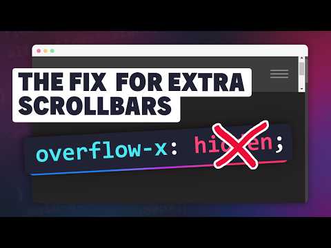
Okay, so imagine this: You’re creating a webpage, and everything looks perfect on your computer. The colors are great, the text is clear—you’re proud of what you’ve built.
But then, one of your friends checks it out on their phone. And bam! Suddenly some of your content spills over in weird ways because of different screen sizes. Ugh, right?
This happens a lot with HTML
No worries though! There’s always a way around it without pulling your hair out and learning complex stuff. We’ll tackle how to prevent those overflow disasters together in simple steps.
And trust me—it’s easier than you might think! Grab a cup of coffee and let’s dive into this neat little challenge together.
Disabling Overflow Property in HTML
Ah, HTML quirks! They sometimes feel like a puzzle. One thing that often trips people up is that pesky overflow issue within DT elements in a definition list. You know when the text just doesn’t seem to fit? Let’s get into it.
First off, what exactly is this overflow thing? Well, imagine you’ve got a box and you’re trying to stuff too much inside. The stuff spills out, right? Pretty much the same with HTML content. The text or other content in your DT element can sometimes spill out of its boundaries if it goes beyond the assigned space.
But how do we handle this? A couple of ways make sense:
- Use CSS: Styling your DT element is the cozy blanket solution. You want to specify what happens when content runs over its boundaries. Here’s where properties like
overflow,white-space, or eventext-overflowcome into play. -
Let’s take an example:
dt { white-space: nowrap; /* Keeps your text on one line */ overflow: hidden; /* Will cut off excess text */ text-overflow: ellipsis; /* Adds those three little dots (...) when you cut things off */ } - Add Some Flexibility: If you’re aiming for a more fluid design, play around with percentages and relative units (like em or vw). Responsive design adjusts automatically based on screen size.
- No Wrap Zone: By setting your DT element’s CSS property to zero-padding or considering margins carefully—you might avoid unwanted spillovers.
Anecdote time!: I had this friend who always grumbled about his website headers cutting off midway through sentences. He was using absolute units without considering screen adaptability—classic rookie move! After adjusting his approach to flexible units and adding smart styling, he finally got that “Eureka!” moment.
Remember! Work through these step by step ensuring everything aligns perfectly for those smooth scrolling experiences users love.
And yeah—don’t forget testing! Different browsers can behave differently — quirky right?
Happy coding adventures ahead folks!
Preventing Element Overflow in CSS
Got it! Let’s chat about preventing element overflow in CSS. Ah, the dreaded overflow issue—if you’ve ever dabbled in web design, you know when things just don’t fit where they’re supposed to. So you’re working on your website, and suddenly, your content is spilling out of its container like a mug overfilled with coffee. It’s annoying!
Why does this happen? Well, often it’s because the size of the content is larger than the space available to display it. Kind of like trying to fit a square peg into a round hole.
Let’s see how we can fix that:
- Setting Overflow CSS Property: There are multiple values for controlling overflow. You might use
overflow: hidden;to simply cut off anything that doesn’t fit. Essentially putting a lid on that overflowing mug. - Create Scrollbars: If hiding isn’t ideal because some info is too crucial to miss, use
overflow: auto;. This creates scrollbars only when necessary, letting users scroll through all of it. - Word Wrapping: For text-heavy elements like paragraphs or DT elements (definition terms), use
word-wrap: break-word;. It ensures words break properly without sticking out awkwardly.
Sometimes I remember my friend who built her first website in college. She didn’t worry about overflow issues until she noticed visitors couldn’t read half her posts because texts were cut-off! Lesson learned.
Here’s another neat trick:
- Max Width: You might find setting a max width useful using something like
.container { max-width: 100%; }, especially helpful for responsive designs ensuring no nasty spillovers across devices!
And finally,
- The Box Model Understanding: Sometimes unexpected overflows occur due to misunderstanding borders or paddings within your box model! Remember margins add space outside borders while paddings add inside—simple yet easily overlooked!
Hope these pointers help keep those HTML cups capped tight! If not perfect first try—that’s okay—it’s about iterating and adjusting till everything fits snugly together just right… almost makes coding sound cozy doesn’t it?
CSS Property for Controlling Overflow Visibility
Let’s chat about something that’s pretty handy if you’re messing around with CSS—controlling overflow visibility. If you’ve ever had content spilling out of its container in your web design, you know just how annoying that can be! I remember this one time, I had a project due and everything looked perfect—until I realized my text was peeking out like it was trying to escape the page!
Alright, let’s get into some details here. You’ve got this magical property called overflow. Its main job? To decide what happens when your content is larger than its parent element. There are a few values you might wanna use:
- visible: The default value. Your content will spill over and not be clipped at all. Choose it if you don’t mind a little chaos!
- hidden: This one’s great for tidiness—it’ll clip or hide any part of the content that’s too big.
- scroll: Adds a scrollbar to the element, so users can see the rest of the content if they want.
- auto: Works like magic! It adds scrolling only when it’s needed; otherwise, it leaves things as they are.
If you’re dealing with HTML <dt> elements and their containers, here’s an example for ya:
“`css
dt {
overflow: hidden;
white-space: nowrap;
text-overflow: ellipsis;
}
“`
What does all this do? With overflow: hidden;, anything that doesn’t fit gets cut off nicely. Then there’s white-space: nowrap;, forcing your text to stay on one line only (no wrapping). And finally, adding an elegant dot-dot-dot with text-overflow: ellipsis;, which indicates that there’s more going on beyond what meets the eye.
Controlling overflow can really change how neat and professional your website appears. Getting those small details right matters—you wouldn’t want visitors thinking you’ve ignored something important! Keep experimenting until things look just right for you.
You know, dealing with HTML content overflow, especially in
The thing is, HTML and CSS can be quite the dynamic duo once you get the hang of them. Overflow happens when the content inside an element doesn’t fit within its designated space. And if you’re curious about those
For starters, it’s all about using CSS properties to manage overflow. Different folks have different approaches; but for me, setting things like `overflow: hidden;` or `overflow: auto;` often does the trick to contain everything neatly within borders.
And then there’s text wrapping—think of it as giving your text a gentle nudge so it knows when and where to break lines without looking awkward. By setting `word-wrap: break-word;`, you can avoid words squeezing out beyond their limits.
Some might go further and use media queries—those magical conditions that let your page adapt no matter if it’s viewed on a phone or a giant TV screen. It feels like tailoring clothing so it fits perfectly no matter what size someone is wearing today.
But honestly? No solution is one-size-fits-all in this messy world of web design! You tweak settings here-and-there until things finally sit pretty… Or at least demurely enough that they don’t poke outside their containers like rebellious toddlers refusing bedtime.
So yeah! The adventure continues every time we revisit these little quirks again-and-again—they’re part-and-parcel of crafting something both beautiful and functional online!